Sharepoint 2010 having a different concept of themes then Sharepoint
2007. Sharepoint 2010 having a new theme engine. You can do cool things
such as create a theme in PowerPoint, export it and then import it
into SharePoint 2010, click apply and you got a custom theme. One
aspect that I could not find documented is the definition of when you
choose a color for a particular element what is it really changing?
If you modify the theme for a site you can use the picker to choose a OOTB or custom theme. Or you have the ability to choose your own color scheme via the following elements.
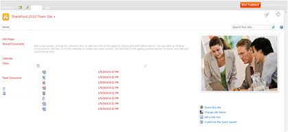
My approach: Make each element white to start with and then one by one add color and document the results. Just for kicks here is what it looks like when it is completely white… (not a color scheme I would recommend…) I will be using a red color: #C12345 for testing.
Here are the details for each one of the elements above:
Text/Background- Dark 1 (41 Classes)
- Page Title Hyperlink Text
- Hover Text
- VB Body Text
- Site Action Menu Text
- Left Navigation Links Text
- Site Setting Page Text Headers
Text/Background - Light 1 (37 Classes)
- Body Background
- Toolbar Background
- Quick Launch Borders
- Web Part Header Background
- Site Action Menu Background
- Site Action/Welcome Text Color
- Pop-Up Window Background
Text/Background - Dark 2 (43 Classes)
- Top Banner Background
- Left Navigation Header Text
- Recycle Bin/View All Site Content Text
- I Like/Tags Notes Text
- Library Column Text
- Site Action Drop Down Border
- Breadcrumb Current Location Text
- List Description Text
Text/Background - Light 2 (19 Classes)
- Browse Tab and hover Background
- Title Container Background
- Top Links/Header 2 Background
- Quick Launch Background
- Web Part Adder Background
Accent 1 (10 Classes)
- Quick Launch Hover Text
- Top Link Selected Tab
Accent 2 (4 Classes)
- .ms-error
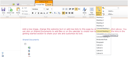
- Rich Text Colored Heading 2 Text Styles
Accent 3 (9 Classes)
- Rich Text “Caption” Style Text Color
Accent 4 (5 Classes)
- Border Under Web Part Selector
Accent 5 (3 Classes)
- Rich Text Colored Heading 4 Text Styles
Accent 6 (3 Classes)
- Rich Text Highlight background color
Hyperlink (12 Classes)
- Toolbar Text Color
- VB Body Hyperlink Text
- a:link Class Text Color
- Web Part Title Hyperlink Text (Not Visited)
Followed Hyperlink (2 Classes)
- .ms-WPBody a:visited
- a:visited
I hope this post will help you when
you decide to create your own theme via the above elements. If you
create your own theme you can simply view the source of the page and
there will be a unique CSS style sheet reference
“_themes/16/corev4-8digithex.css?ctag=#”.


No comments:
Post a Comment