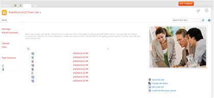
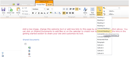
With the launch of SharePoint 2010, I thought it might be fitting to
start focusing on the design and branding element of SharePoint and show
the world what can be done when you are thinking of being creating with
the product.
Leading on from that I am doing to launch a series of Top 20′s
ranging from search box examples , navigation examples and my favourite
sites all based on the platform of SharePoint.
So to start the series off I am going to start with my Top 20
Examples of Creative Navigation, with a brief summary of why I like it.
They are in no particular order and are the opinion of myself. Enjoy.
So then, let the showcase commence…
1. Carbon Trust

I really like the font they have used for starters and I think the
hover state with the reverse colour is effective combined with the
immediate show of the sub navigation, which has a subtle fade for the
potential white-on-white scenario.
http://www.carbontrust.co.uk
————————————————————————————————————————————————
2. BSG Blog

I love this Silverlight navigation, orbiting around home/earth button
is really cool. I always love the little touches of the shooting star,
UFO that flies across and the twinkle of stars that happens every now
and again. All in all and unique and very creative navigation that can
be achieved with the combination of SharePoint and Silverlight.
http://blogs.bsg.co.uk
————————————————————————————————————————————————
3. Linklaters

I really like big and bold navigation as it is one of most important
elements of any website – clear navigation. Looking at it now as a
little picture your eyes are drawn to the logo and navigation instantly.
This navigation uses drop down menu functionality with combined with
the purple arrow and purple text in hover state just polishes is clean
and simple example.
http://www.linklaters.com
————————————————————————————————————————————————
4. Central Ohio Technical College

One good way to gain your users attention is the use of animation.
Too much can be overpowering and annoying but used subtly it can be a
great way to get them clicking. This navigation I like because I did
just that, I was hovering over all the menu options over and over, the
animation is smooth and colourful.
http://www.cotc.edu
————————————————————————————————————————————————
5. Hyder Consulting

Something a bit different in terms of layout, on top of a large
photo, which sometimes can make navigations lost within the background.
One way to counter this is using a large navigation which I this site
does well, combined with white text in hover state in the line of sight
with the logo and search area, this site navigation works.
http://www.hyderconsulting.com
————————————————————————————————————————————————
6. Victorinox

The use of the burgundy background with the white navigation as well
as the capitalisation of lettering works really effectively and even
more so when reversed on the hover state. Leading on from this, the sub
menu and the active menu state still using the reverse color of white
background and burgundy hover state on the submenu polishes off this
example perfectly.
http://www.victorinox.com
————————————————————————————————————————————————
7. Arts & Auto

I really like colour-categorised navigation, it is a simple way to
break up and easily identify content within sections on your website.
Not only have they done this and have incorporated a dropdown / sub menu
with some navigation, in which when cooked together they’ve baked a
nice piece of animation with a nice design.
http://www.artsenauto.nl
————————————————————————————————————————————————
8. Hyro

Sometimes when you have a clean site you don’t need to use a
graphically heavy navigation. Also using a clean and crisp navigation
can really complement a design, which this site does and does well. Not
over the top, no animation just simple text with a simple hover state
that of an underline. Simples
http://www.hyro.com
————————————————————————————————————————————————
9. Sdu Uitgever

Not my favourite of navigation examples but I think it is important
to demonstrate something different and with that I respect. One thing
all creative designers should be looking to do is think outside of the
box and this navigation does.
http://www.sdu.nl
————————————————————————————————————————————————
10. SharePoint HQ

What I particularly like about this is the combination of colour
palette (I love those blues), the animation and the bottom-right
gradient they have used. Also what I think is good to recognise is the
contrast of the menu with the background it sits on, creating enough
contrast to make the user experience seamless without looking out of
place.
http://www.sharepointhq.com
————————————————————————————————————————————————
11. Lutron

Having a site with a large navigation structure can be tricky to
present in a clean and clear way, which isn’t busy and cluttered. This
site does this perfectly! It is well presented and even incorporates a
little bit of content in the sub menu pane. The only thing I think
ruins, what could be a lovely example, is the animation for the sub menu
pane, I think it very ‘choppy’ and quite violent on the eyes going from
a brown palette in their photography then to be presented with a white
background instantly. My opinion is that a nice piece of fade in/out
animation would be perfect here.
http://www.lutron.com
————————————————————————————————————————————————
12. Central Ohio Technical College

Similar to Central Ohio Technical College further up, this is
animating up instead of to the right, BUT with a little twist not only
does this navigation animated up it also changes the image below based
on what you option you have decided to hover over. Although it is flash
and I think that it is cheating to use a flash menu on a SharePoint
site, I like it and it is my blog so I will include! but this will be
the only one I promise! I would like to think that CCB have used flash
to tap into a list to power their navigation, if they have then then I
suppose that’s a decent compromise.
http://www.ccb.pt
————————————————————————————————————————————————
13. Ferrari

If there is one colour that goes with a strong and vibrant color like
red it is grey and in particular gun metal grey, one of my favourites.
What I think makes this navigation really cool is that use of imagery on
the drop down boxes to emphasis the area you are in and could head over
to, I also like the animation that is used just tops off the whole
navigation.
http://www.ferrari.com
————————————————————————————————————————————————
14. Safe Network

First thing I noticed on this navigation was the shadow that is used
on the right/bottom of the drop down which really gives the sub menu
definition. With a site that used big, bold colours the navigation
supports this really well. I also like the way the top header and
navigation sit on top of the image slider/view that is used behind the
site.
http://www.safenetwork.org.uk
————————————————————————————————————————————————
15. Rado

Sometimes you just need to go back to the basics! The brand for this
site is clearly black and white, using this they have kept their
navigation simple, but with a twist. Using the sub menu they have added
the functionality of when you hover over the different options you are
presented with a visual representation, in this case a picture of the
watch based on the what model you hover on. A perfect example of
simplicity works.
http://www.rado.com
————————————————————————————————————————————————
16. Goodman
 One thing I like is trying
something different! Clever navigation based on their logo the ‘+’
(plus) sign really works well. Instantly identifiable with the logo you
cant help but notice that Goodman use a + as there logo. Going back to
the navigation you are clearly presented with 5 options which takes you
to various areas. Once in those areas they use a standard navigation you
see everywhere, shame really as their initial navigation is cool.
http://www.goodman.com
————————————————————————————————————————————————
17. Cox

This is a common trend I have seen where people use the navigation to
tell people the sections they will be clicking on them and underneath
what the section is about. It can be used really effectively sometimes
but also can become a very busy as well on the flip side. Just wish they
had a mute button for the woman…
http://www.coxhelpcenter.com
————————————————————————————————————————————————
18. Embark

Sometimes you didn’t even need to use the conventional horizontal or
vertical navigation. This site shows us you can use a search interface
to get around your site however I will always put my money on that
people prefer the normal way of navigation as that is what people are
used to. But I think it is a good example of what can be done
especially with the search capabilities within SharePoint.
http://www.embark.com
————————————————————————————————————————————————
19. Neudesic

What I want you to focus on here is the use of the ‘house’ icon for
the home button. First time I have seen this on a SharePoint site and it
is a really good way to free up a bit of space if needed and is
instantly recognisable as the button to click to go ‘home’.
http://www.neudesic.com
————————————————————————————————————————————————
20. 1 By Youth

Another example of pushing the boundaries of navigation with
SharePoint is using the overwhelming power of CSS. Using the hover state
and mixed with an image for the background you can instantly create a
unique hover experience for your navigation as demonstrated here.
http://www.1byyouth.com
————————————————————————————————————————————————
Well there you have it! Some great examples of all the different possibilities of what can be achieved with SharePoint. I


